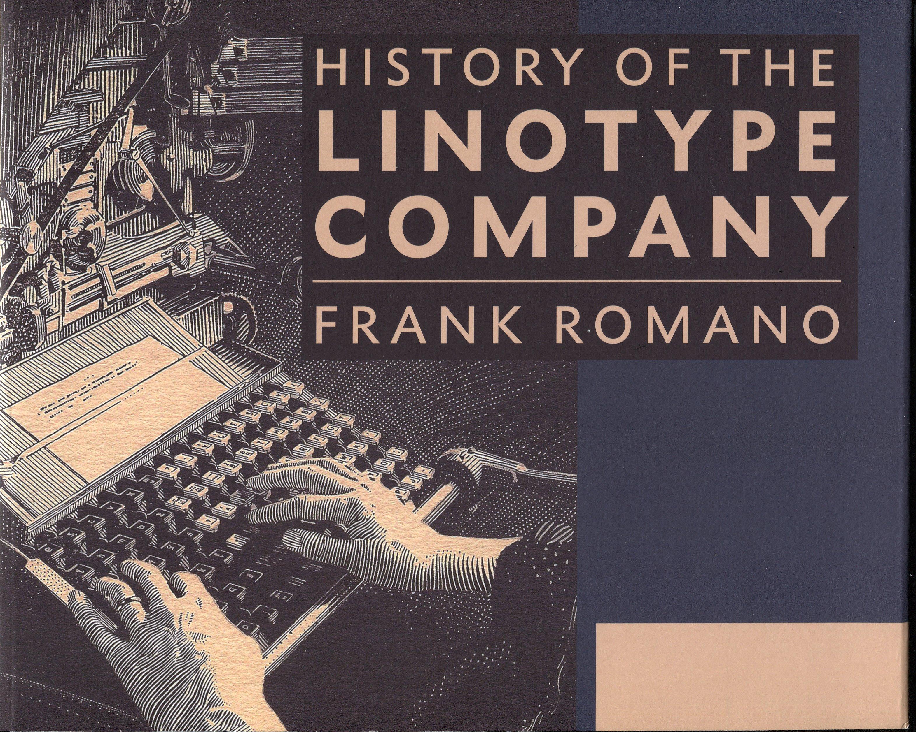
Few inventions changed the cultural and political landscape as profoundly as those involving cheap and quick copying of words. Gutenberg’s movable type made books available to multitudes of people with enormous consequences for civilization. However, manual composition was still too slow and expensive to mass-produce cheap newspapers. The invention of hot-metal typesetting by Ottmar Mergenthaler and his contemporaries made printing much faster and cheaper. It is difficult to fully quantify the consequences since it coincided with the advent of radio, and both these events had a similar effect: the deep penetration of news into everyday life. However, there is little doubt that newspapers and cheap books were very important in the history of the last century. For about one hundred years—until the advent of digital typesetting—Linotype machines ruled the world of mass-produced copy. While newspapers were the first adopters of the new technology, many others followed; as Frank Romano writes in his book, during World War II every US warship larger than cruiser class had a Linotype machine on board.
The Mergenthaler Linotype Company, established in 1886 (as Mergenthaler Printing Company) has a rich and interesting history. It included tumultuous arguments with the eponymous inventor, lawsuits, patent fights, mergers, acquisitions—and also technological innovations, hard workers, great artists and daring visionaries. Besides development and promotion of hot-metal typesetting, the company created an enormous number of typefaces, pioneered teletypesetting (again of huge importance for the newspaper business), experimented with phototypesetting and contributed to digital composition. The experience of its engineers with precision mechanical devices allowed the company to venture into other areas, including the production of bombsights and other armaments (especially during the wars).
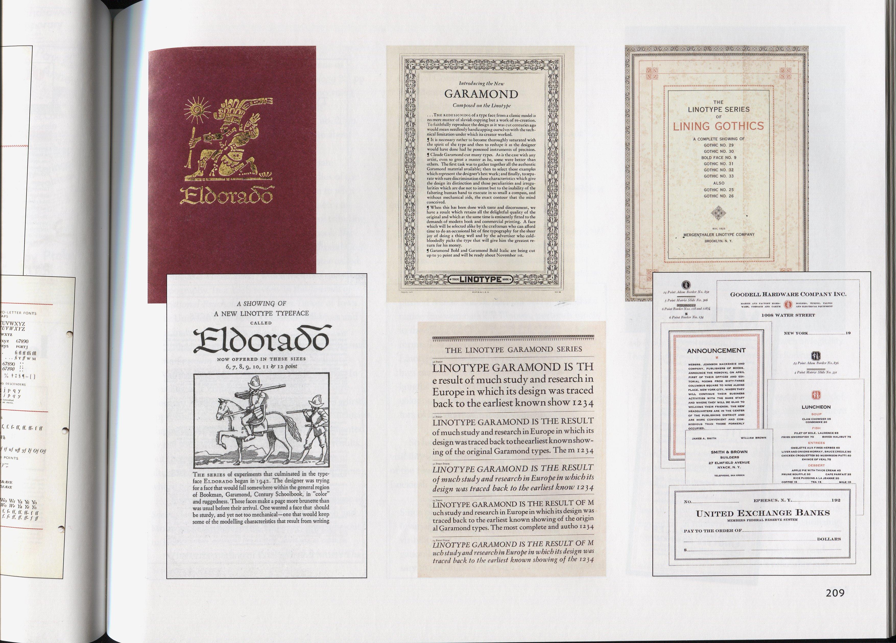
Frank Romano, now an Emeritus Professor with RIT, worked at Linotype for eight years. He has written a brilliant book about the company—not a dry list of milestones, but rather a work of love and appreciation. The book includes, in excerpts or in full, rare or previously unpublished documents, such as the autobiography of Ottmar Mergenthaler, manuscripts, letters, earning reports, court filings, newspaper articles, brochures, author’s own interviews, and many others. The book is lavishly illustrated, with hundreds of reproductions of samples, advertisements, photographs, books and other materials that Linotype published over 127 years of its existence.

Romano’s foremost interest is in the people at Linotype. The book has many vivid biographical sketches of extraordinary individuals who worked for the company or otherwise influenced it: from Ottmar Mergenthaler himself to the reclusive investor Gurdon Wattles (by the way, a role model for Warren Buffett). The people described in the book do not appear as cartoonish figures on a backdrop of Linotype’s history: Romano has a rare ability to portray all his personages, even those mentioned only briefly, as alive and real. The human side of the history is his strongest feature.
Another interest for the author is evidently the financial side of company activity: he writes about its mergers, acquisitions and loans with attention to detail. If one wants to know the net income of the Mergenthaler Company in 1967 or how many founders’ shares were issued at the company incorporation, the information can be found in the book. The author also describes the lawsuits Linotype was involved in, including those about font copyright, which are still very relevant in the US.
The book devotes many pages to the influence of the company on the art of typography. Romano reproduces cover pages and spreads of the famous Linotype manuals, which defined the trends for contemporary typesetting. He describes the huge work the company did in the design of typefaces. Among the people of Linotype described in the book are Chauncey H. Griffin, Harry L. Cage, Paul A. Bennett, Mike Parker, and many other figures in the world of font design and typesetting.

Having worked at Linotype from 1959 to 1967, from mail boy to assistant ad manager, Romano devotes a chapter of his book to his personal reminiscences. It describes the life at the great company in the Sixties with loving detail: from the quality of food in the nearby restaurants to the generosity of expense accounts to the typical day in the ad department. This chapter is great reading for any lover of history.
Romano also briefly touches on the history of technology: hot-metal typesetting and other relevant inventions, such as punch-cutting machines and double-wedge spaceband. I wish, however, he had been as detailed here as in other parts of his book. I feel the book could have been improved by the inclusion of historical drawings, e.g., from the company’s patent applications.
The book has many useful appendices, including a detailed index, lists of typefaces originated or used at Linotype (both alphabetical and chronological), a time table and a large bibliography. This makes the book indispensable for amateur and professional historians.
The book is designed by Marnie Soom and typeset in New Caledonia and MetroNova. The fonts are very legible, and the illustrations are excellent.
Despite all the above, I confess I have several gripes with the book design and typesetting.
First, the paper size is 10.5′′ by 8.5′′. This wide book is difficult to read except when sitting at a desk, and even more difficult to leaf through. The book is typeset in three columns with rather narrow margins. More generous margins could have been used for the notes, which are now put at the end of each chapter.
I also do not understand why the book is typeset ragged right. Narrow unjustified columns produce a strange look since the sizes of the gaps are visually comparable to the column width. With the ragged right margin, the indented first line of a paragraph sometimes looks centered (an example of such a paragraph can be found in an illustration above). Interestingly enough, justification was one of the crucial problems for the early Linotype machines, solved only when the company bought John Rogers’s firm with its patent for the double-wedge justifier. As discussed in the book, before this purchase Linotype Co. even tried to refuse to pay Mergenthaler his royalties unless he invented a way to circumvent this patent, arguing that his machine was useless otherwise.
Last, but not least, it is not a good idea to break the line between “Mr.” and the person’s last name, as it is sometimes done in this book.
Despite these minor gripes it is a very good book. I think it might be especially interesting for a TeX audience. Some of the metaphors used in the description of TeX’s algorithms come from the world of hot-metal typesetting. It gives a different perspective to read about the mechanical justifiers, or the literal setting of the slug. Many digital fonts we use now originated at Linotype, and it is fascinating to see how they were created.
I also think this book is essential reading for anybody interested in the history of typesetting and fonts.