


When undertaking graphical experiments on the text of John's Apocalypse over and over, I am always fascinated with the interaction of shape and content which this text stimulates. To my eyes, reading about such horrible events via a font of neutral style, one which would be appropriate for any purpose at all, is disturbing. The conflict between shape and content irritates me. By attempting to compensate for the lack of specific suitability solely by employing appropriate arrangements, I learned that the existing variations of our roman typefaces are dedicated to an aesthetic that is purely self-related.
 My basic interest in creating an interaction of text and contents of
John's Apocalypse in manifold ways has nothing to do with a
fashionable end-of-times mood. The more I give in to previously
unknown possibilities of varying our typefaces, the more I find
confirmation of the fact that script as shape extends beyond
itself. This is very suitable for the text of John's Apocalypse.
My basic interest in creating an interaction of text and contents of
John's Apocalypse in manifold ways has nothing to do with a
fashionable end-of-times mood. The more I give in to previously
unknown possibilities of varying our typefaces, the more I find
confirmation of the fact that script as shape extends beyond
itself. This is very suitable for the text of John's Apocalypse.
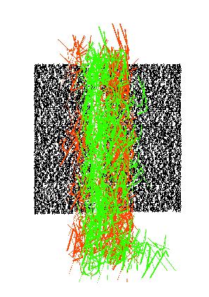
If images - even excellent ones - remain hidden behind the telling of the Apocalypse, one has to try to render the text itself as an image. This relieves the artist from the possibility, as well as the constraint, to provide illustrations. Associations which resemble illustrations are illusionary. This is not about illustrations. The text itself moves into the pictorial domain - those transcriptions can, however, never be interpreted as illustrations. The script merely visualizes itself, being exposed to conditions that are no longer dedicated to legibility.
Due to the nature of roman capitals, they lend themselves easily to such transformations. A special appeal results from the enhancements with digital graphical elements, and astonishing results beyond legibility can be achieved. Structures consisting of very different computer-specific strokes resemble hand-drawings but, although they are static, they exhibit a vivid appearance of a completely different sort.
Most of the attempts are concerned with the contrast of script as text versus script as a language-free play of shapes. Beyond the domain of language, everything can be different. The process of reading is no longer tied to running along the lines with their sequence of words. Relieved of the constraints of reading, the eye can move here and there, can follow the scattering and clustering of lines back and forth, up and down. The irreversibility of the uni-directional nature of reading, a function of correct linguistic interpretation, is obsolete. Furthermore, reception is uncoupled from the semantics of language. The transcriptions can be concentrations, where reading reverts to the latin ``legere''
The liberated characters form something new, still requiring the text as a base, and thus challenge the recipient's thoughts to respond to this unusual play of lines, according to his readiness and ability. Even rejection can be explained: those who regard writing only as a cultural technique, something learned in school, cannot be expected to be very open-minded towards these transcriptions. Such transcriptions are monstrous in terms of linguistic functionality, because they make use of text in non-standard ways. Being unreadable and thus exclusively graphical, the text is only related to itself and is itself the subject of the various visualizations.
Thus, as an observing and thinking being the reader is referred back to himself, his willingness to reflect encouraged.
ALBAN GRIMM, 1999