


Various techniques can be applied to create fonts. For my teaching at the Faculty of Fine Arts, Johannes Gutenberg University Mainz, the goal was to examine the technique-dependent shaping of letter forms. Letters carved in stone appear carved, letters written on paper appear written, and printed letters appear printed. But what appearance is expected from letters that have been created using a computer?
 Considering that the use of computer technology aims at imitating
everything which can be achieved by other techniques, what is a
typical computer result? To answer this question, I had to experiment
with the computer, trying to obtain results that other tools can only
deliver with a lot of effort, or not at all. Furthermore, much of the
basic knowledge has been influenced by traditional techniques and
needs to be reflected in the new context.
Considering that the use of computer technology aims at imitating
everything which can be achieved by other techniques, what is a
typical computer result? To answer this question, I had to experiment
with the computer, trying to obtain results that other tools can only
deliver with a lot of effort, or not at all. Furthermore, much of the
basic knowledge has been influenced by traditional techniques and
needs to be reflected in the new context.
Practically speaking, the models available from type design and calligraphy can only be adopted with respect to clarity and optimal differentiation of shapes. By removing all technique-dependent details, one can concentrate on the radical basic shapes.
When working with METAFONT, one is bound to notice that the basic forms of our roman type, as they are still present in the capital letters, can be reduced to the elementary geometric shapes of triangle, square, and circle. METAFONT easily allows to create a font composed of linear strokes, whose aesthetic and functional substance stems solely from the balance of proportions and the clarity of shapes. It can serve as a basis for multiple variations controlled through parameters.
The principle of parameter control allows for variation of fonts in contrast to using imitated, traditionally static fonts for typesetting. With less effort than ever, the typographer can create a suitable font version and derive modifications to the unimagined.
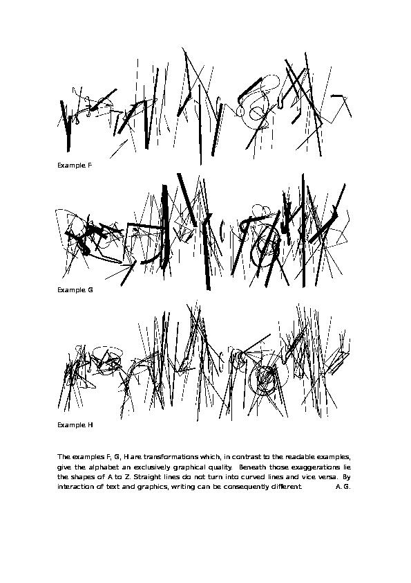
To allow maximum liberty for the derivations offered by METAFONT, it is advisable to avoid derivatives of other origin, such as the development of lowercase letters. An alphabet of uppercase letters with equal height and without elements below the baseline is recommended as the basic font; it is extremely resistant to many kinds of modifications. None of the possible variations will be as balanced as the basic version. All changes inherit their quality from the unambiguity and clarity of the basic shapes of the roman uppercase type. Graphical enhancements and transcriptions of the shapes compromise the original quality to allow for other transformations.
Since application examples almost never show the basic version of this variable capital font, it is necessary to display it in relation to its modifications (the details of parameterization can be omitted in this short description). Much about it is obvious from the results. The variabilities range from readable characters to unreadable, merely ciphered formations. Thus, writing as ``visible language'' can carry more than just language content. Text as a graphical area--whether readable or not--can in this manner be experienced as a very vigorous matter. The traditional, classical printer fonts lack this vitality due to the perfection of their details. Even if the several versions of this font called ``VN'' occasionally appear to be hand-written, they are stereotypes. This is of importance, since it is not a simulation of the written hand. The broad nib rotation and width variation could not be achieved manually.
The repeated use of the Apocalypse as text is because this font was developed while I was searching for a suitable typeface for this text. The Apocalypse versions presented are not final results, but mere finger exercises to practise the use of this font seriously. The graphic sheets are not to be interpreted as illustrations. They simply let the text be graphics--exceeding its linguistic function. The meta aspect of Knuth's METAFONT is being extended.
Otherwise, this variable uppercase font consequently picks up what was outlined in The METAFONT Book (chapter 21). My VN font is just one example of developing alternatives to traditional type design that are typically digital.
ALBAN GRIMM